REG AUS BANK - APP DESIGN
Designing
Regional Australias
new Banking App
DESIGN
BRANDING
STORYTELLING
UX COPYWRITING
REG AUS BANK - APP DESIGN
Designing
Regional Australias
new Banking App
DESIGN
BRANDING
STORYTELLING
UX COPYWRITING
REG AUS BANK - APP DESIGN
Designing
Regional Australias
new Banking App
DESIGN
BRANDING
STORYTELLING
UX COPYWRITING
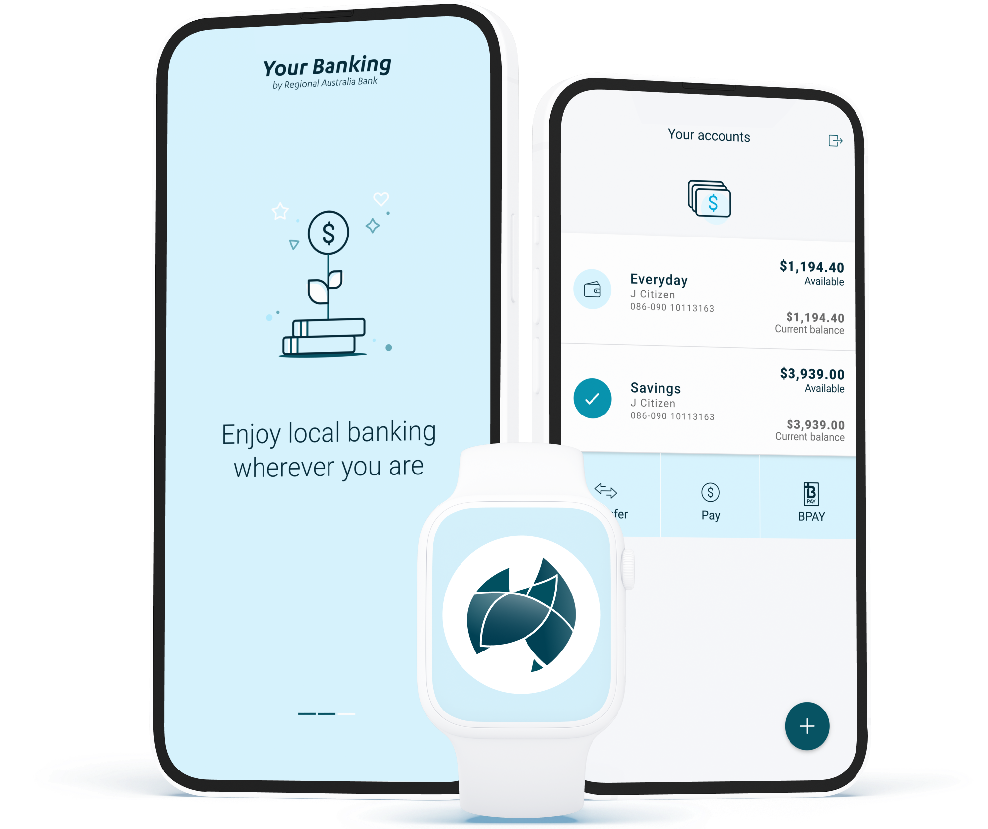
Naming
In addition to consistent storytelling,
we created a new app name as the original name was too long for mobile display.
Styling
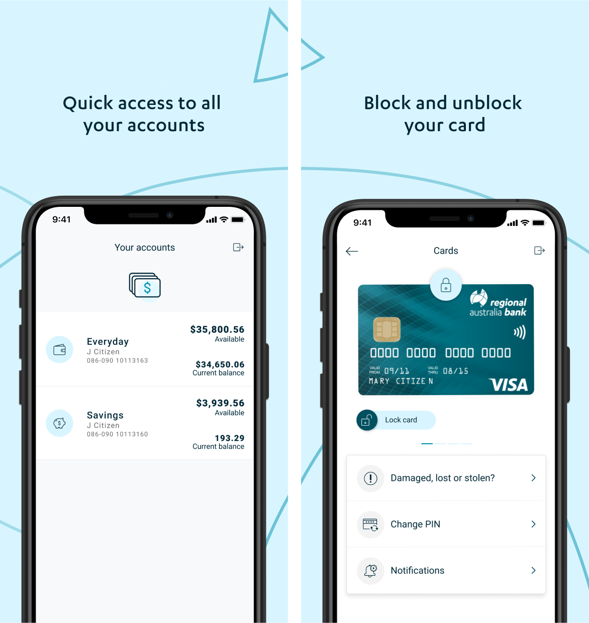
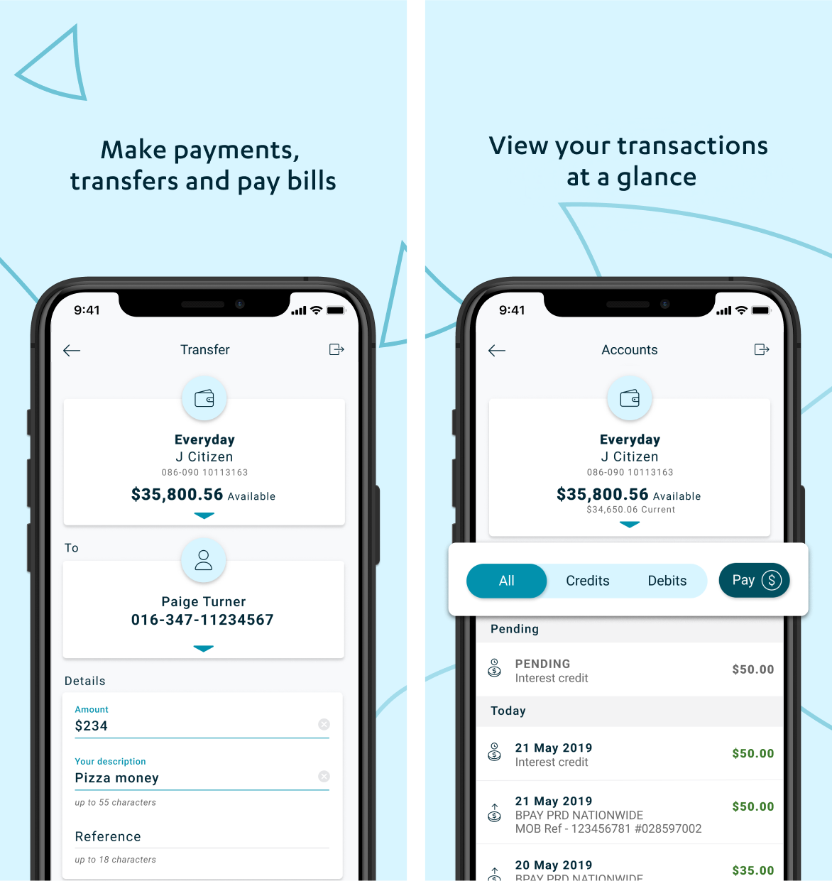
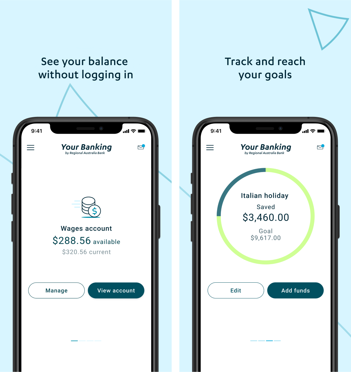
We revamped RAB's banking app with a fresh look and feel, incorporating new colours, iconography, and animations.
Design
We've introduced new Iconography, complementing RAB's current Icon style, including the app logo system icons.
Naming
In addition to consistent storytelling, we had to create a new app name as the original bank name was too long for mobile display.
Styling
We revamped RAB's banking app with a fresh look and feel, incorporating new colours, iconography, and animations.
Design
We've introduced new Iconography, complementing RAB's current Icon style, including the app logo system icons.
YOUR BANKING
—
Regional Australia Bank engaged Muteo for this comprehensive app styling project. The brief included refining communications and storytelling, redesigning app and system icons, and introducing new colours for a fresh and modern look.
YOUR BANKING
—
Regional Australia Bank engaged Muteo for this comprehensive app styling project. The brief included refining communications and storytelling, redesigning app and system icons, and introducing new colours for a fresh and modern look.
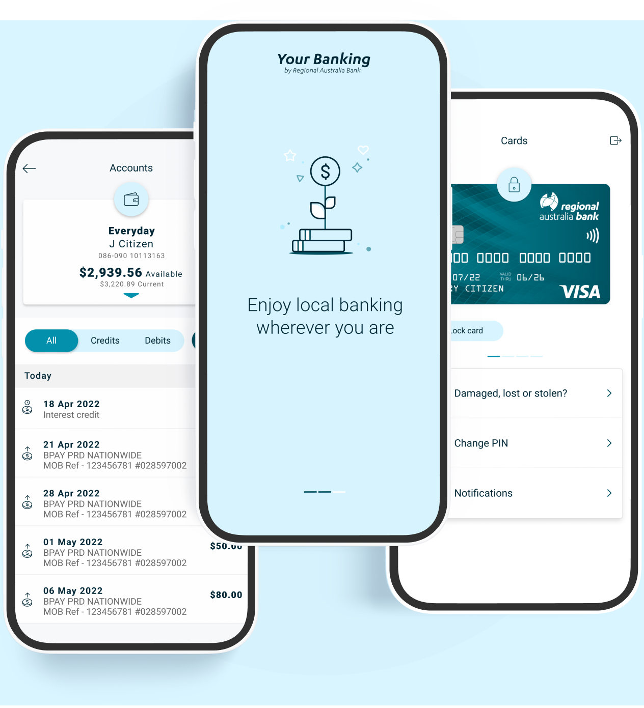
The Task
Regional Australia Bank briefed us to design a new and modern visual experience for their next App launch, built within the Ultra Data framework.

The Task
Regional Australia Bank briefed us to design a new and modern visual experience for their next App launch, built within the Ultra Data framework.
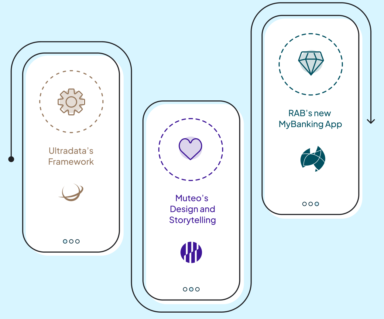
The Challenge
We had to design an engaging and visually appealing narrative within the constraints of Ultra Data's framework - In which customisation of colour, styles and size of animations and icons was limited.
The Challenge
We had to design an engaging and visually appealing narrative within the constraints of Ultra Data's framework - In which customisation of colour, styles and size of animations and icons was limited.

I have had the pleasure of working with Muteo on several occasions, each time being impressed by the quality of their work. They are a creative and professional team that is always focused on the needs of our customers
Michael Howlett
Digital Experience & Product Manager
I have had the pleasure of working with Muteo on several occasions, each time being impressed by the quality of their work. They are a creative and professional team that is always focused on the needs of our customers
Michael Howlett
Digital Experience & Product Manager
I have had the pleasure of working with Muteo on several occasions, each time being impressed by the quality of their work. They are a creative and professional team that is always focused on the needs of our customers
Michael Howlett
Digital Experience & Product Manager
I have had the pleasure of working with Muteo on several occasions, each time being impressed by the quality of their work. They are a creative and professional team that is always focused on the needs of our customers
Michael Howlett
Digital Experience & Product Manager
01
Welcome Screens
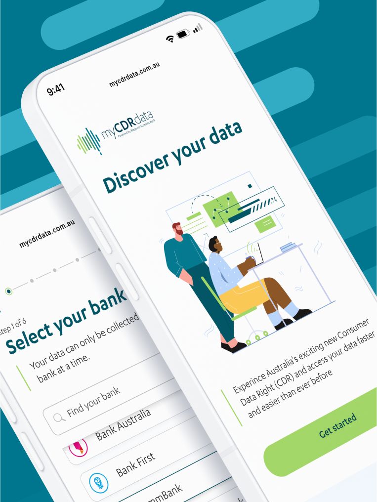
We created and animated welcome narrative screens for users entering the app for the first time.
01
Welcome Screens
We created and animated welcome narrative screens for users entering the app for the frist time.
02
Iconography
We designed 28 thematic icons to outline the different sections of the app the user can explore.
02
Iconography
We designed 28 thematic icons to outline the different sections of the app the user can explore.
Designing an experience that is engaging and helps people understand how the CDR works.
We designed 28 thematic icons to outline the different sections of the app the user can explore.
We designed 28 thematic icons to outline the different sections of the app the user can explore.
Designing an experience that is engaging and helps people understand how the CDR works.
03
Animations
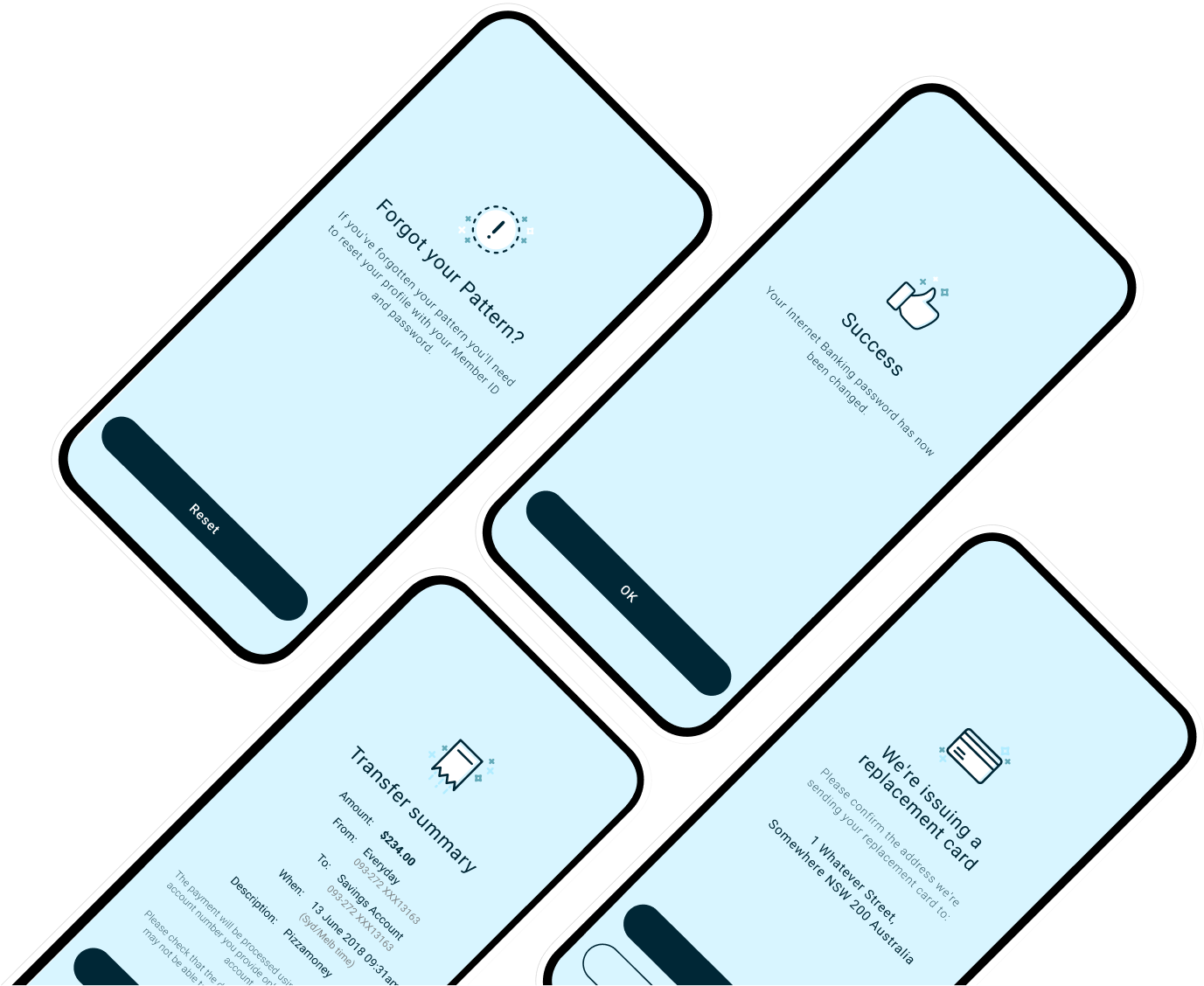
We designed micro animations for each key ‘success screen’, giving the user a sense of accomplishment and increasing the fun-factor when completing a task.

03
Animations
We designed micro animations for each key ‘success screen’, giving the user a sense of accomplishment and increasing the fun-factor when completing a task.
The Branding
The Branding
LOGO & WORDMARK
ICONOGRAPHY
ANIMATED ICONS
ANIMATED ICONS
04
Loader Screens
The loader and splashscreen animations show the brand colours in dynamic and playfull ways.
04
Loader Screens
The loader and splashscreen animations show the brand colours in dynamic and playfull ways.
05
Menu Header Icons
We created 15 iconography for the header menu items that reflects the purpose and functionality of each section.
05
Menu Header Icons
We created 15 iconography for the header menu items that reflects the purpose and functionality of each section.
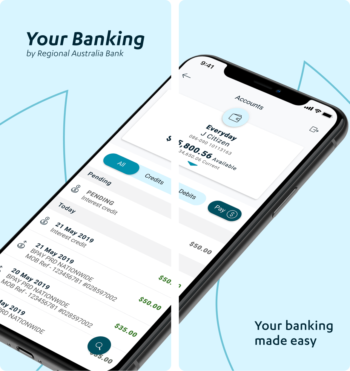
APP STORE SCREENS
The Team
Here's to Daniel Antonius, Darren Kirk, Stella Palmer and the Ultra Data team for bringing the app to life. Thanks of course to the amazing people at Regional Australia Bank, led by Michael Howlett, who continue to push the boundaries of the UAD framework with us.
_
The Team
Here's to Daniel Antonius, Darren Kirk, Stella Palmer and the Ultra Data team for bringing the app to life. Thanks of course to the amazing people at Regional Australia Bank, led by Michael Howlett, who continue to push the boundaries of the UAD framework with us.
_
MORE OF OUR WORK
MORE OF OUR WORK
MORE OF OUR WORK
WE DESIGN FOR /
PEOPLE + TRANSPARENCY + SIMPLICITY + LOYALTY + EQUALITY + SUSTAINABILITY + DATA PRIVACY + TRUSTWORTHINESS + OPTIMISATION + INNOVATION + POSITIVE ENGAGEMENT + ACCESSIBILITY + EMPOWERMENT + INSPIRATION + COLLABORATION / TO GIVE YOU THE EDGE
WE DESIGN FOR / PEOPLE + TRANSPARENCY + SIMPLICITY + LOYALTY + EQUALITY + SUSTAINABILITY + DATA PRIVACY + TRUSTWORTHINESS + OPTIMISATION + INNOVATION + POSITIVE ENGAGEMENT + ACCESSIBILITY + EMPOWERMENT + INSPIRATION + COLLABORATION / TO GIVE YOU THE EDGE
