BIZA - REBRAND
Transforming
the Identity of
a Fintech Icon
BRANDING
STORYTELLING
UX/UI DESIGN
BIZA - REBRAND
Transforming
the Identity of
a Fintech Icon
BRANDING
STORYTELLING
UX/UI DESIGN
BIZA - REBRAND
Transforming
the Identity of
a Fintech Icon
BRANDING
STORYTELLING
UX/UI DESIGN
Branding
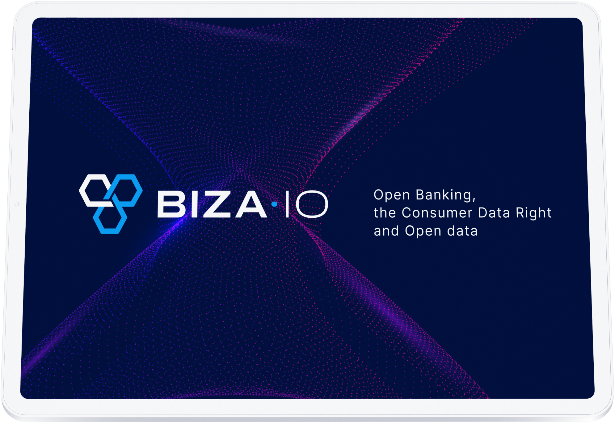
We have given BIZA's identity a complete makeover, encompassing logo, colours, iconography, and typography.
Storytelling
We created a compelling narrative for BIZA's value proposition, target audience, and services.
Experience
We've taken BIZA's online presence to the next level, incorporating their new identity and elevating the User Experience.
BIZA REBRAND
—
We were tasked with a comprehensive overhaul of BIZA's branding, encompassing logo, collateral, communications, iconography, and website. The outcome was a detailed style guide, providing clear guidance on applying BIZA's new look consistently across all channels and touchpoints.
BIZA REBRAND
—
We were tasked with a comprehensive overhaul of BIZA's branding, encompassing logo, collateral, communications, iconography, and website. The outcome was a detailed style guide, providing clear guidance on applying BIZA's new look consistently across all channels and touchpoints.

The Task
Revamp BIZA’s brand identity to better communicate their services as holistic CDR integration experts. Visual concept to reflect the simplicity of their integration methods.

The Task
Revamp BIZA’s brand identity to better communicate their services as holistic CDR integration experts. Visual concept to reflect the simplicity of their integration methods.
The Challenge
Re-engineer BIZA’s existing branding to better reflect its vision and help build experiences that move their customers.
The Challenge
Re-engineer BIZA’s existing branding to better reflect its vision and help build experiences that move their customers.

01
Colours
We created a strong and defined multipurpose colour palette. Easy to apply across platforms while embodying the same security, seriousness and trust.
01
Colours
We created a strong and defined multipurpose colour palette. Easy to apply across platforms while embodying the same security, seriousness and trust.
02
Typography
A typeface combination with two feels: one with personality and the other utilitarian. The pairing aligns BIZA alongside Australia’s major financial institutions while keeping a unique flair.
02
Typography
A typeface combination with two feels: one with personality and the other utilitarian. The pairing aligns BIZA alongside Australia’s major financial institutions while keeping a unique flair.
A typeface combination with two feels: one with personality and the other utilitarian. The pairing aligns Biza.io alongside Australia’s major financial institutions while keeping a unique flair.
A typeface combination with two feels: one with personality and the other utilitarian. The pairing aligns Biza.io alongside Australia’s major financial institutions while keeping a unique flair.
Designing an experience that is engaging and helps people understand how the CDR works.
Designing an experience that is engaging and helps people understand how the CDR works.
03
Mini
Styleguide & Branding
03
Mini
Styleguide & Branding
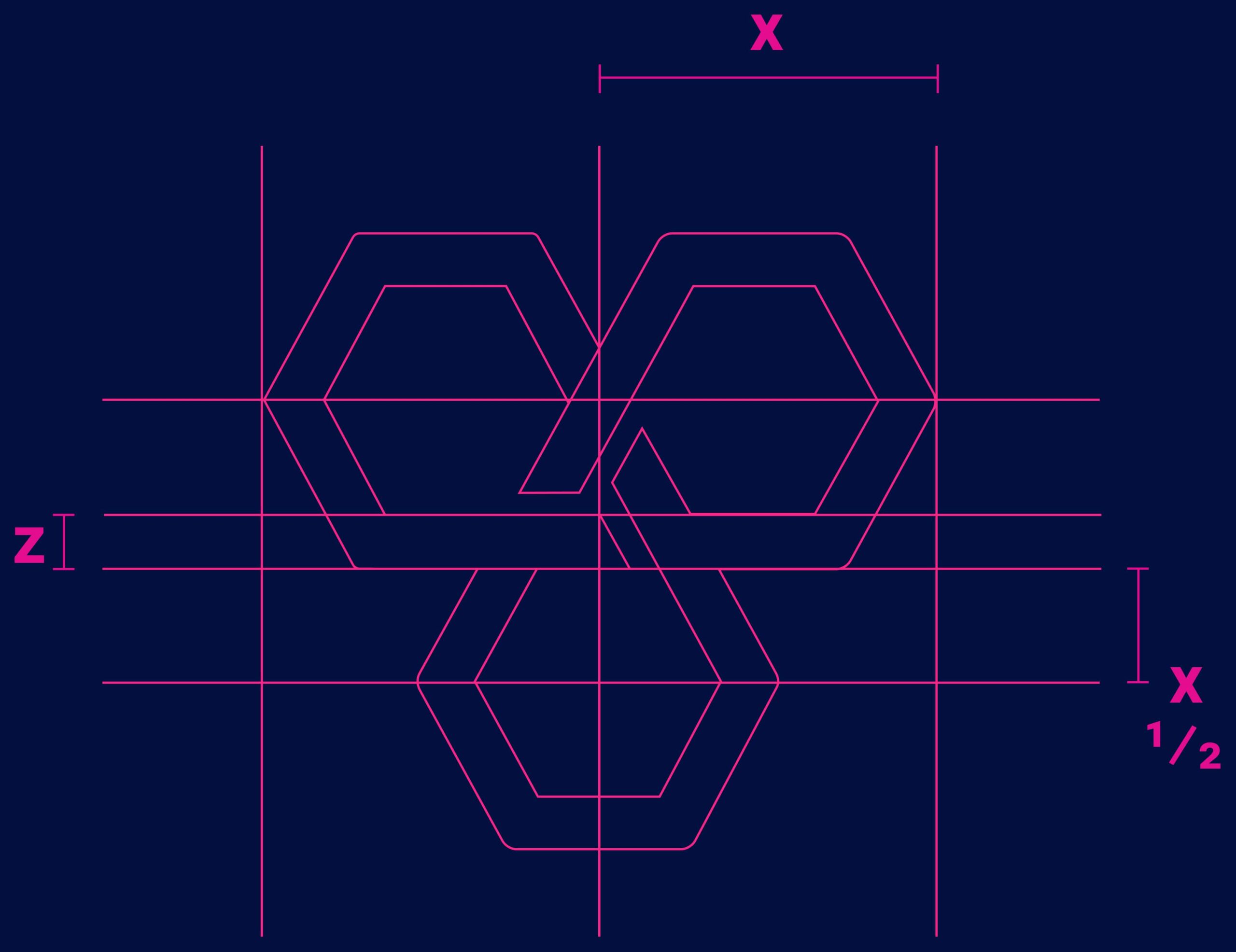
LOGO AND WORDMARK
ICONOGRAPHY
04
Collateral
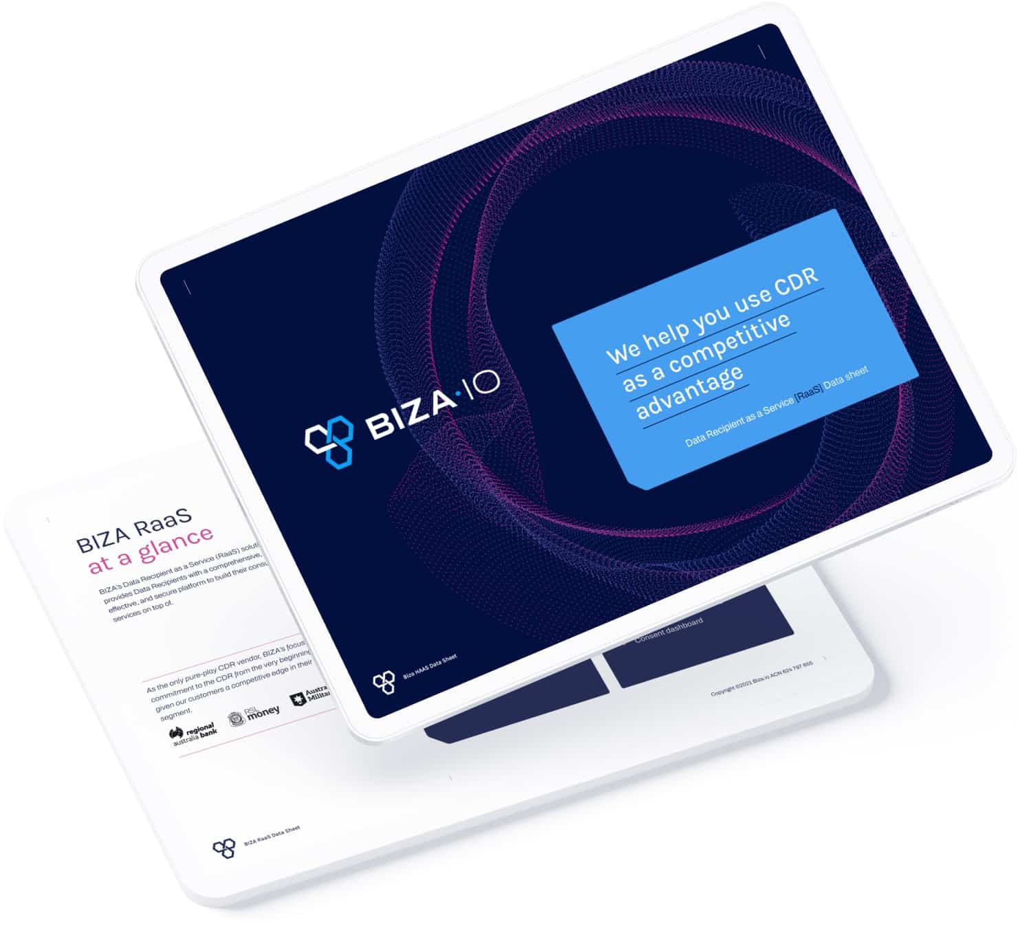
Collateral for brand promotion and marketing. Designed with BIZA’s core values and personality.

04
Collateral
Collateral for brand promotion and marketing. Designed with BIZA’s core values and personality.
05
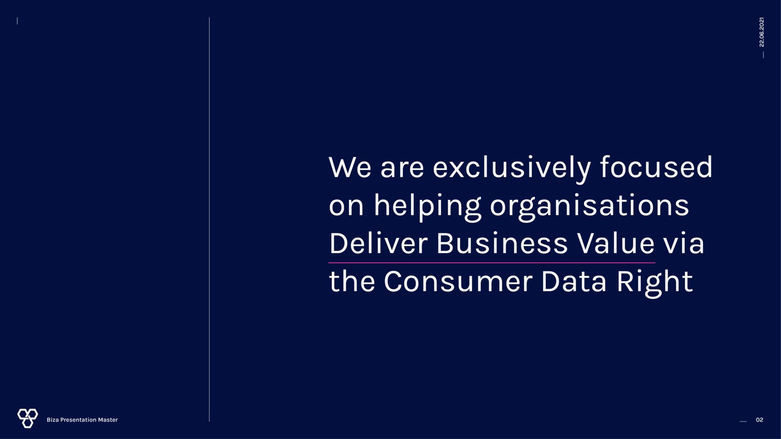
Presentaion Slides
Collateral for brand promotion and marketing. Designed with BIZA’s core values and personality.
05
Presentaion Slides
Collateral for brand promotion and marketing. Designed with BIZA’s core values and personality.
06
Website
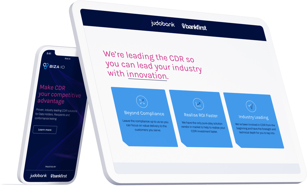
A refresh of BIZA’s existing website with the new branding.

06
Website
A refresh of BIZA’s existing website with the new branding.
The Team
Here's to Natalie Short for helping with the Icon library and to Mathew Mytka for his subject matter expertise, bringing BIZA's comms to the point. A big shout out to Daniel Antonius, who championed BIZA's brand tone, UX copy, and collateral comms.
_
The Team
Here's to Natalie Short for helping with the Icon library and to Mathew Mytka for his subject matter expertise, bringing BIZA's comms to the point. A big shout out to Daniel Antonius, who championed BIZA's brand tone, UX copy, and collateral comms.
_
MORE OF OUR WORK
MORE OF OUR WORK
MORE OF OUR WORK
WE DESIGN FOR /
PEOPLE + TRANSPARENCY + SIMPLICITY + LOYALTY + EQUALITY + SUSTAINABILITY + DATA PRIVACY + TRUSTWORTHINESS + OPTIMISATION + INNOVATION + POSITIVE ENGAGEMENT + ACCESSIBILITY + EMPOWERMENT + INSPIRATION + COLLABORATION / TO GIVE YOU THE EDGE
WE DESIGN FOR / PEOPLE + TRANSPARENCY + SIMPLICITY + LOYALTY + EQUALITY + SUSTAINABILITY + DATA PRIVACY + TRUSTWORTHINESS + OPTIMISATION + INNOVATION + POSITIVE ENGAGEMENT + ACCESSIBILITY + EMPOWERMENT + INSPIRATION + COLLABORATION / TO GIVE YOU THE EDGE

